Logo Design Projects – Concept & Spec Thinking
A showcase of five logo systems across diverse industries, developed with brand narrative, form symbolism, and scalable application in mind.
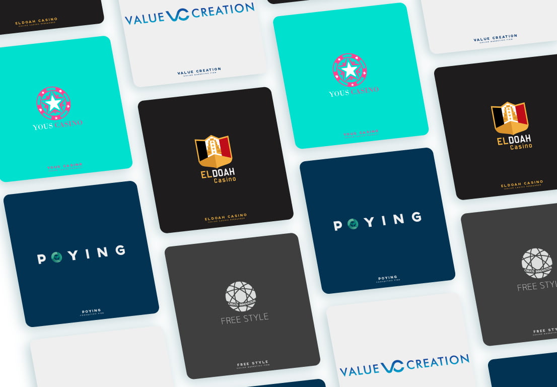
1. POYING — Consultant Service Brand
Industry: Business Consultancy
Concept Keywords: Growth, Stability, Trust, Wholeness
- The “O” integrates a budding leaf, symbolizing growth and nurturing support.
- Green conveys balance and sustainability, while the dark navy background projects professionalism and emotional stability.
- Font choice is geometric and minimalist to reflect modern structure and clarity.
- The entire system is designed to be modular and icon-scalable across digital and print.
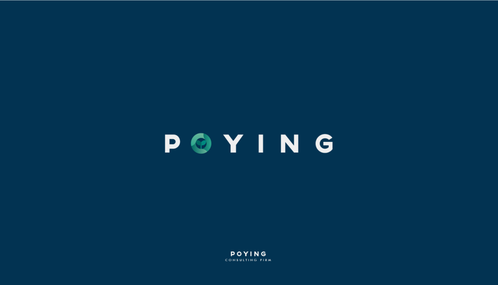
2. [iGaming Client A] – Premium Gaming Platform Logo (Rebrand)
Industry: iGaming / Online Casino
Concept Keywords: Legacy, Adventure, Gateway, Prestige
- This rebranding work draws from a narrative of a ship sailing toward a golden city, reflected in the symmetrical red/black pillars representing an open gate.
- The center vertical structure suggests a golden palace (prosperity), while the lower hull-like base implies motion and exploration.
- Golden yellow is the dominant brand color, signifying luxury and winnings.
- Optimized for shield-style display across app icons, table interfaces, and pre-login environments.
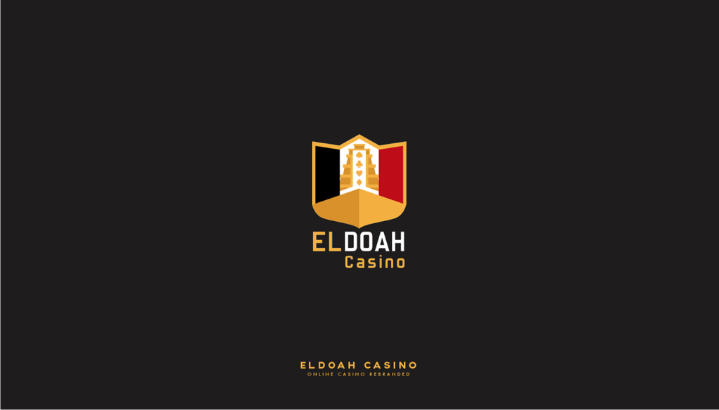
3. [iGaming Client B] – Slot & Fun-Centric Gaming Identity
Industry: iGaming / Social Slots
Concept Keywords: Joy, Player-Centric, Stars, Community
- Star symbol at the center reflects happiness and achievement.
- The ring of player figures forms a circular bond, surrounded by card suit icons to subtly reference the casino genre.
- Pink and turquoise palette chosen for its friendly and vibrant appeal.
- Design allows strong mid-size visibility—ideal for mobile avatars and in-app headers.
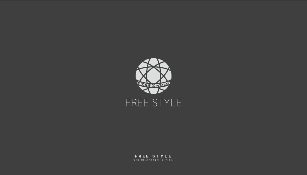
4. FREESTYLE – Global Online Marketing Firm
Industry: Digital Marketing / Creative Strategy
Concept Keywords: Global Network, Connectivity, Innovation
- A globe built from interconnecting arcs represents global outreach and flexible innovation.
- The phrase “CREATE INNOVATION” wrapped around the equator anchors the brand’s core purpose.
- Neutral grayscale tone projects adaptability and multi-industry compatibility.
- Built as a vector-first structure, ideal for use in responsive UI and multi-language environments.
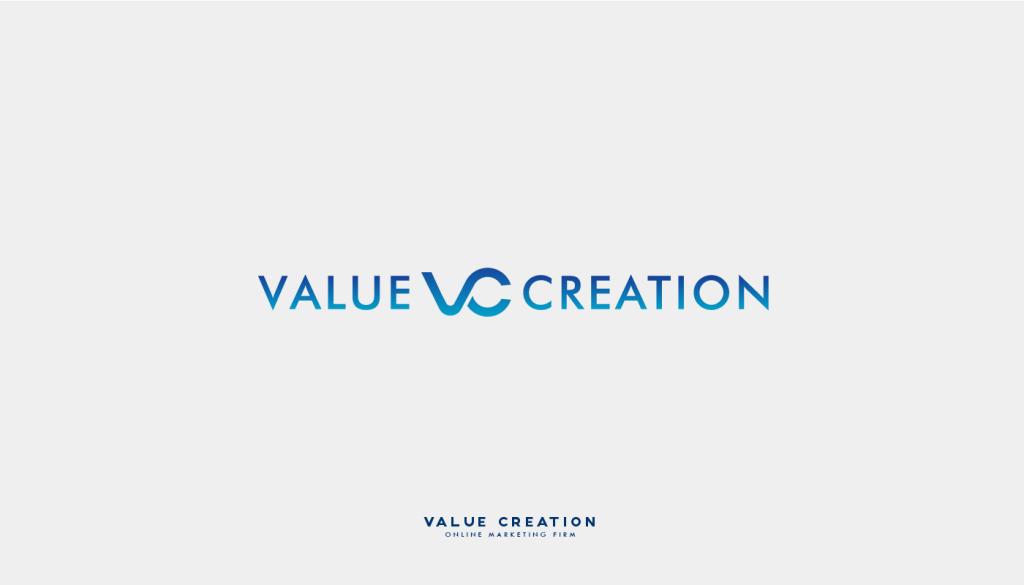
5. VALUE CREATION – Digital Strategy & Marketing Company
Industry: Online Marketing / Brand Growth Concept Keywords: Trust, Connection, Infinite Possibility
- The merged “V” and “C” form a flowing, infinite loop shape — representing continuity in value creation.
- Blue gradient palette is used to convey clarity, professionalism, and commitment.
- Font is uppercase sans-serif for legibility and long-term scalability.
- Design system emphasizes harmony between brand mark and wordmark for consistent digital identity.